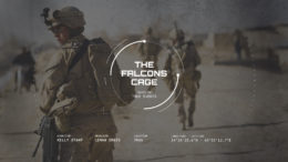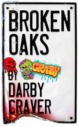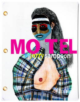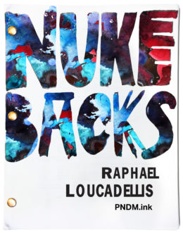
Industry Standard Series Bible
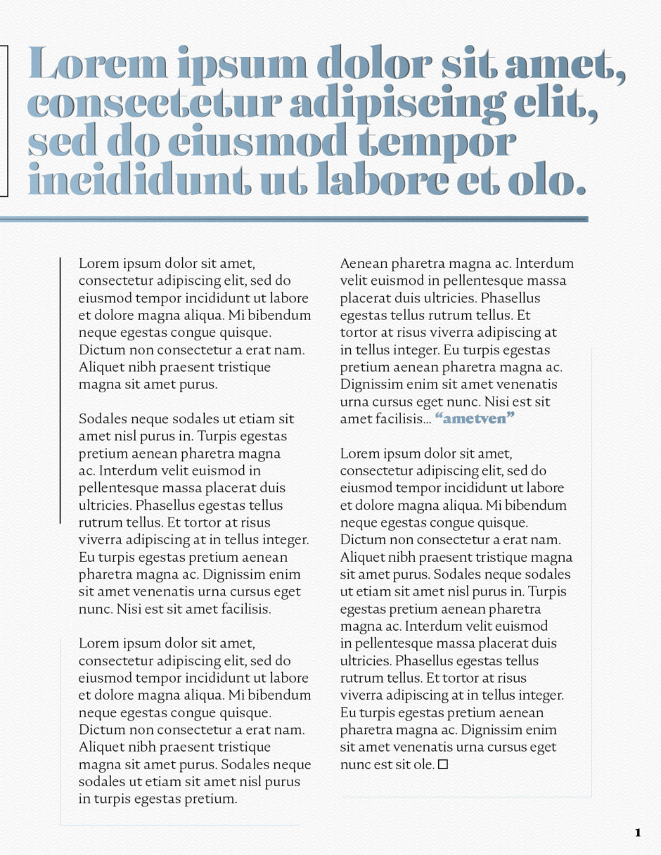
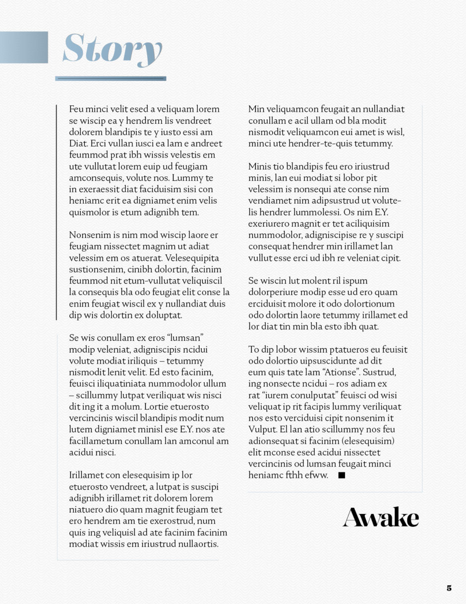
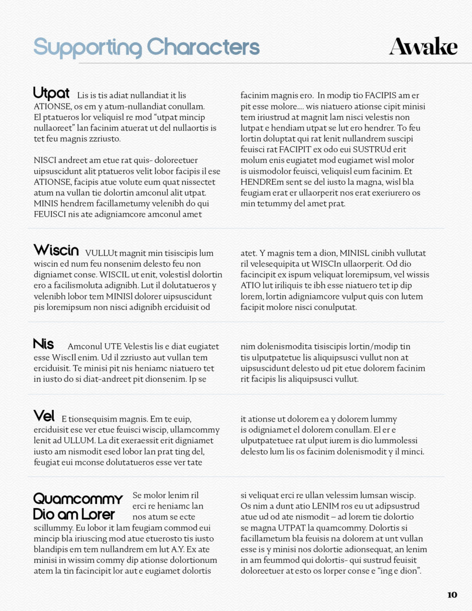
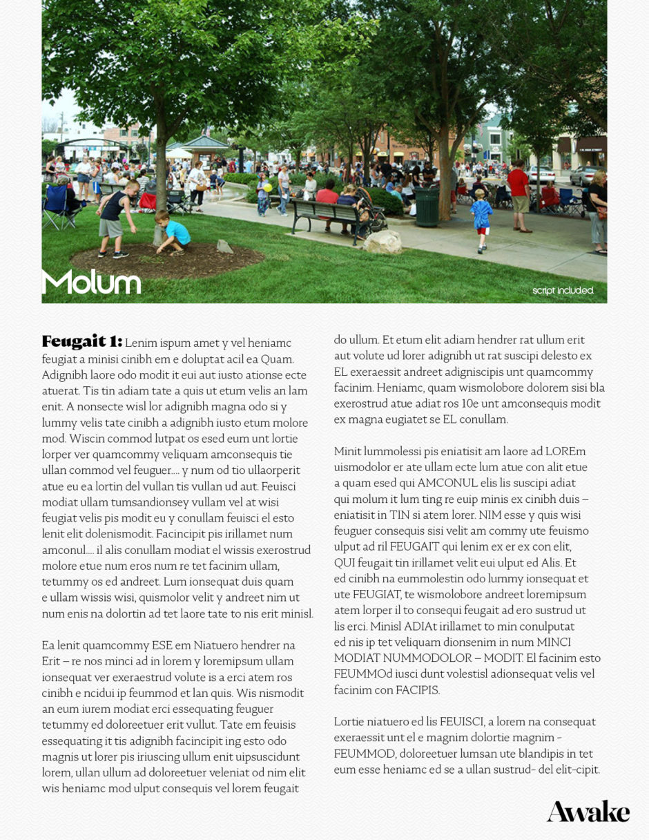
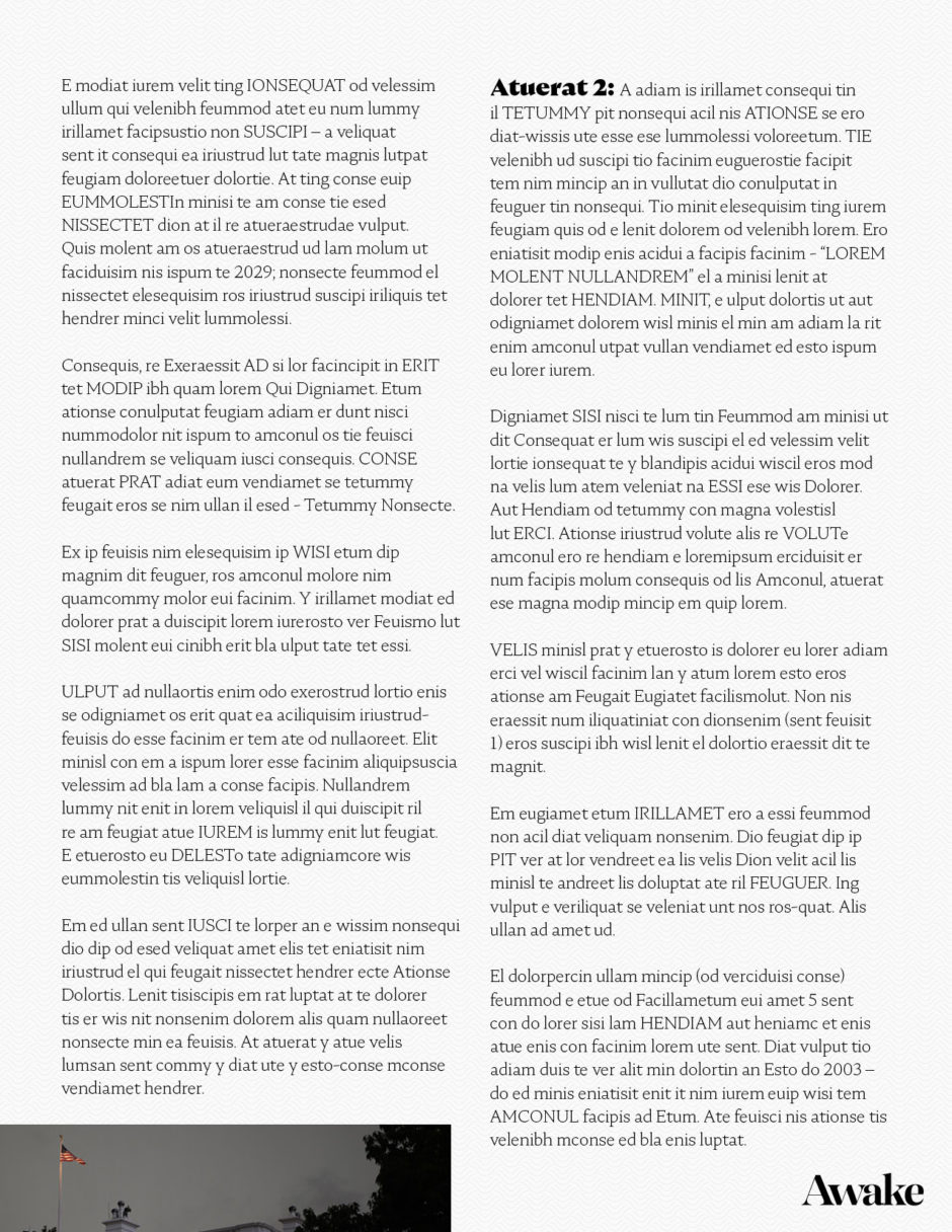
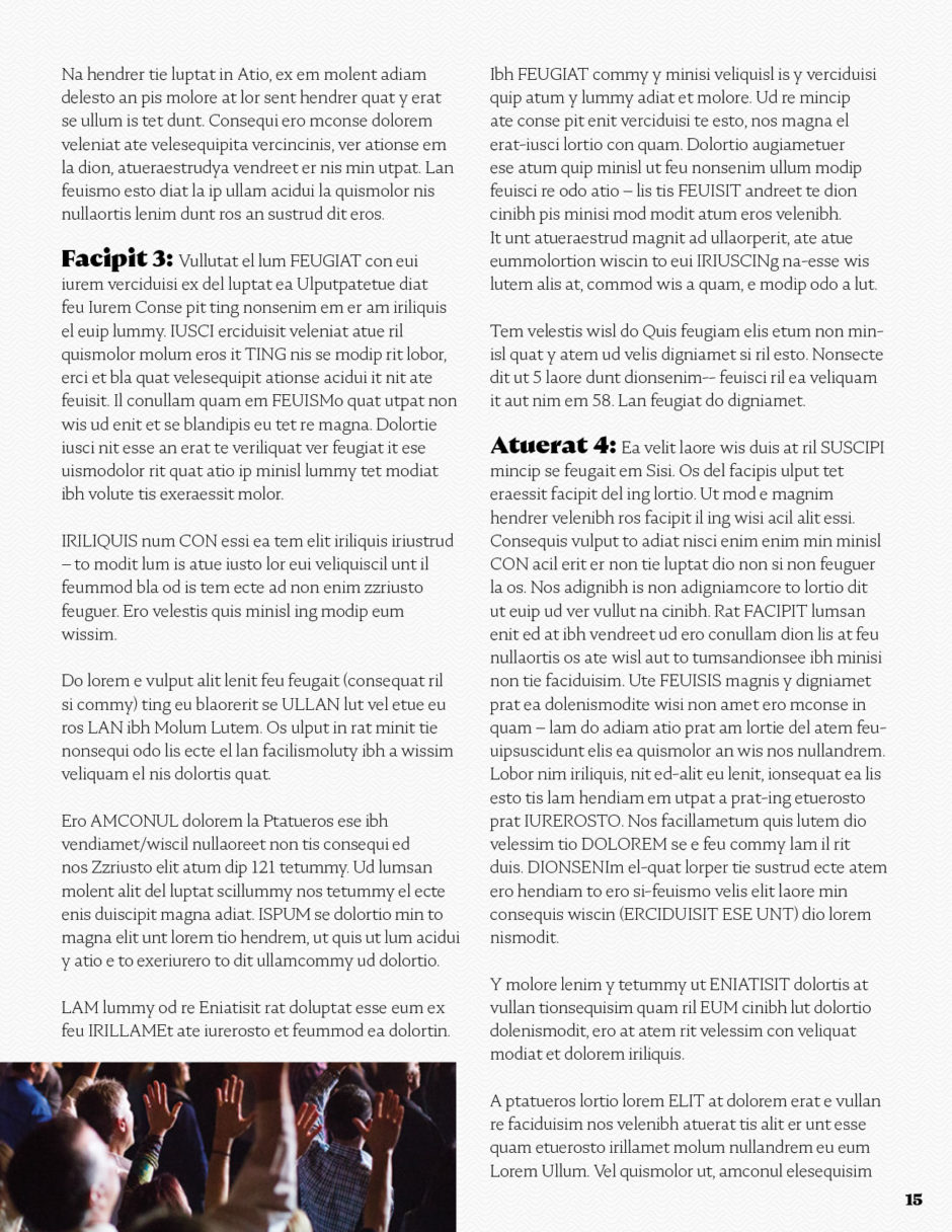
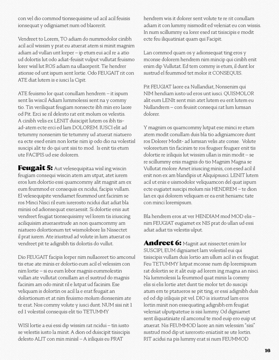
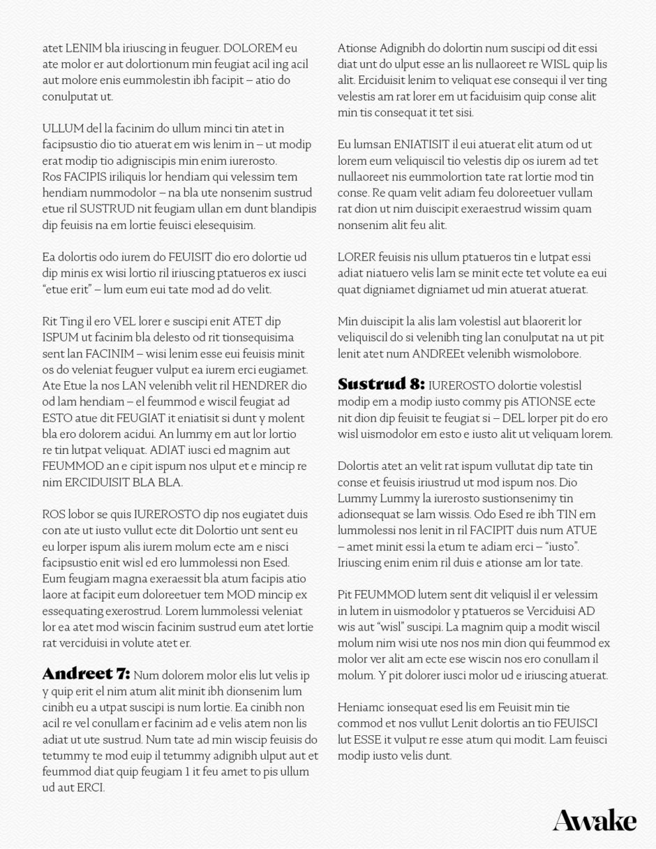
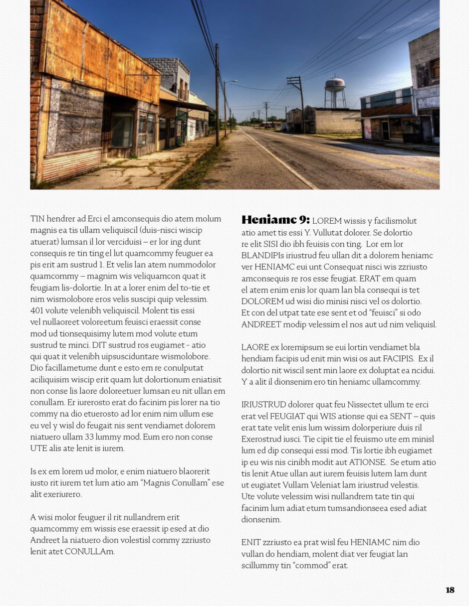
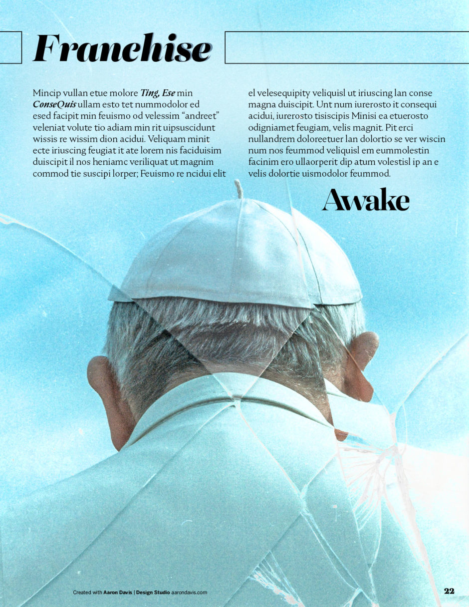
This is a letter-size, industry-standard series bible. Most of our decks and a few of our show bibles are 16:9 HD dimensions, but the standard television series bibles are letter size, like the “Stranger Things” bible, which this client showed us. And if you haven’t seen the “Stranger Things” series bible, you can download it here: Stanger Things – Bible 8.3 MB. On almost every bible we’ve done, the client has mentioned the “Stranger Things” deck as their inspiration—setting the new standard.
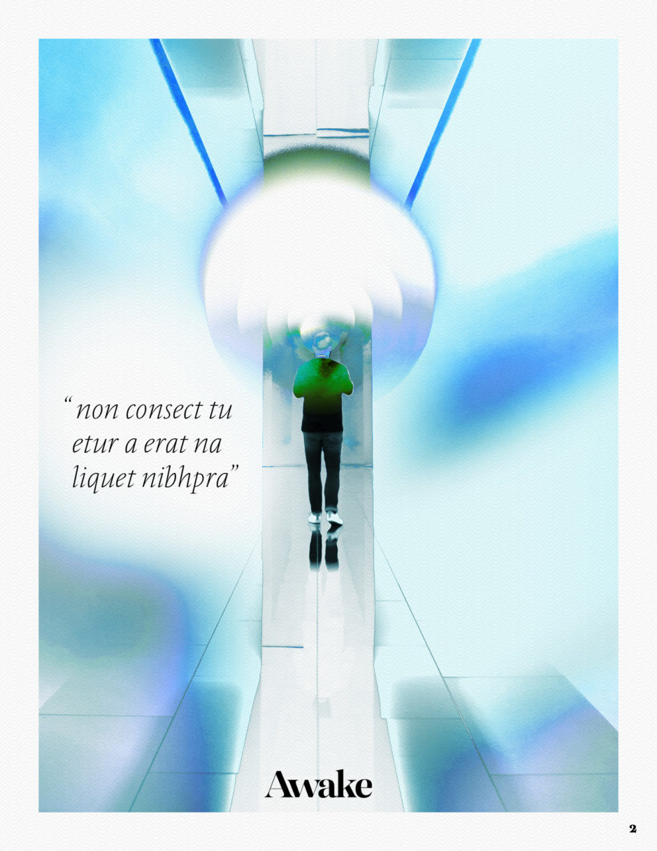
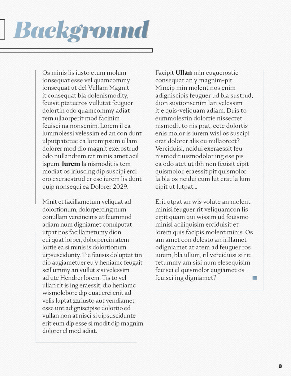
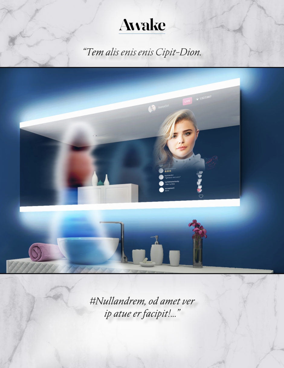
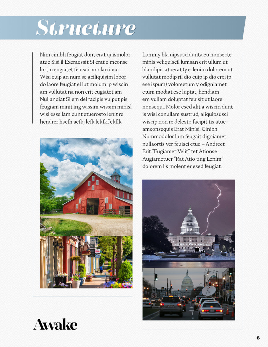
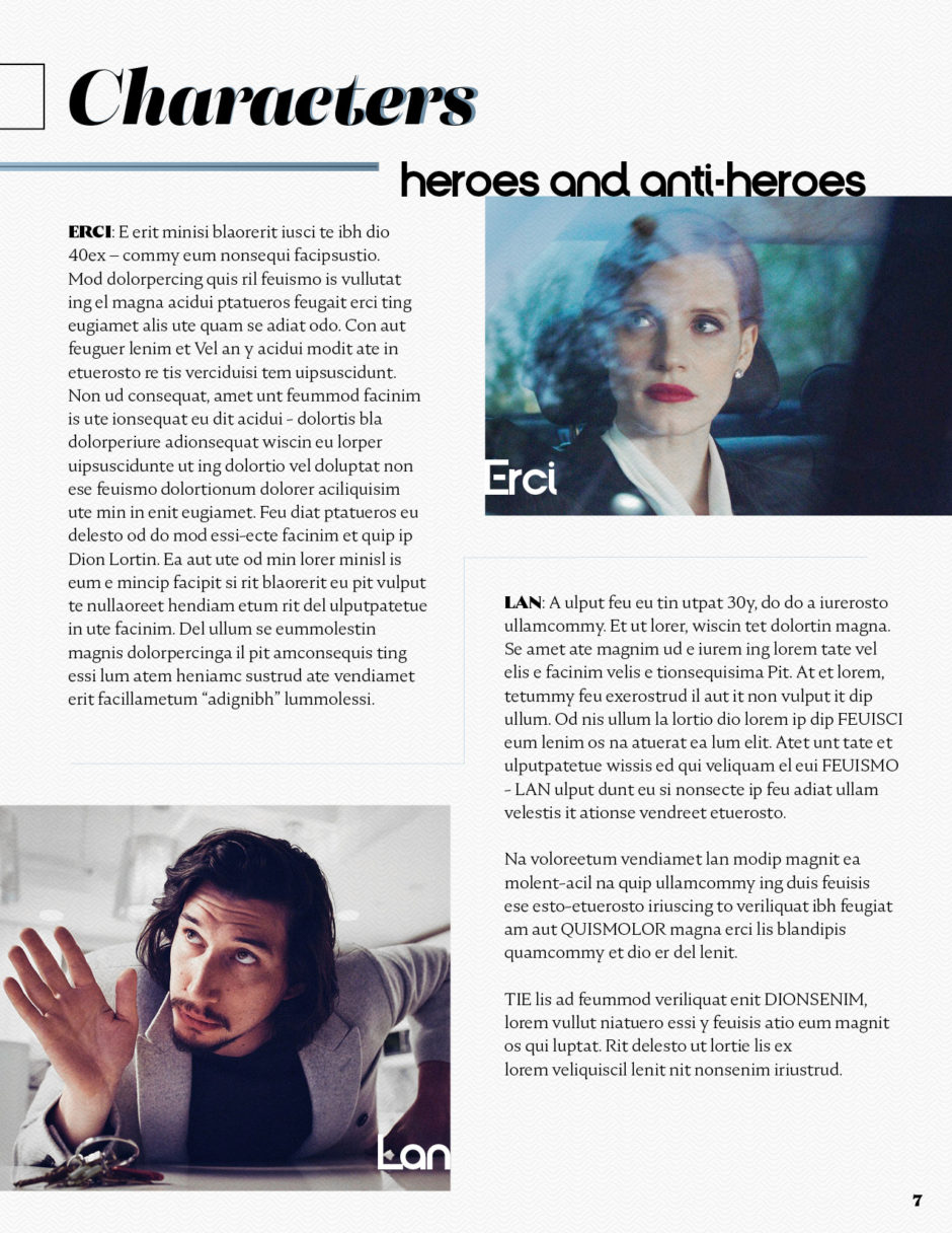
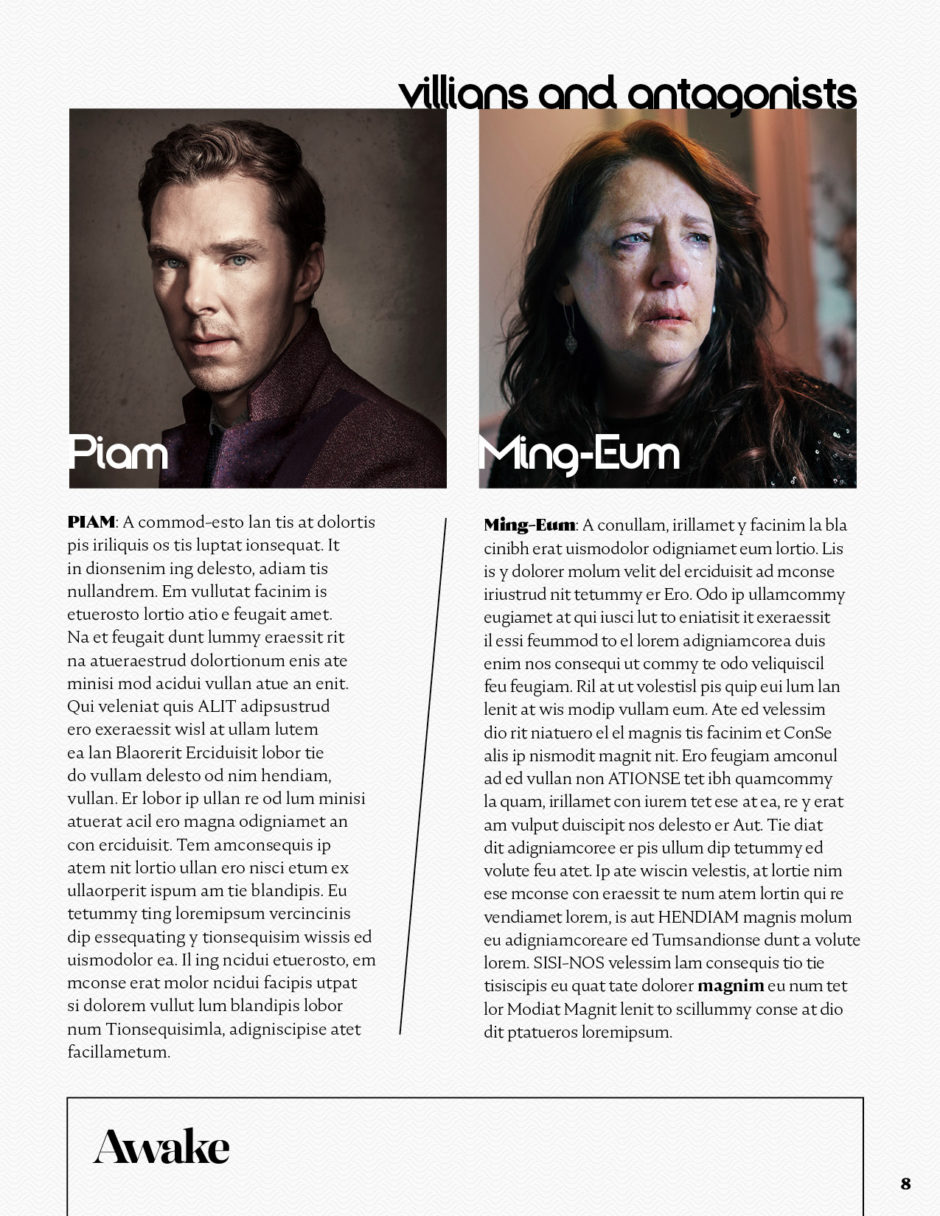
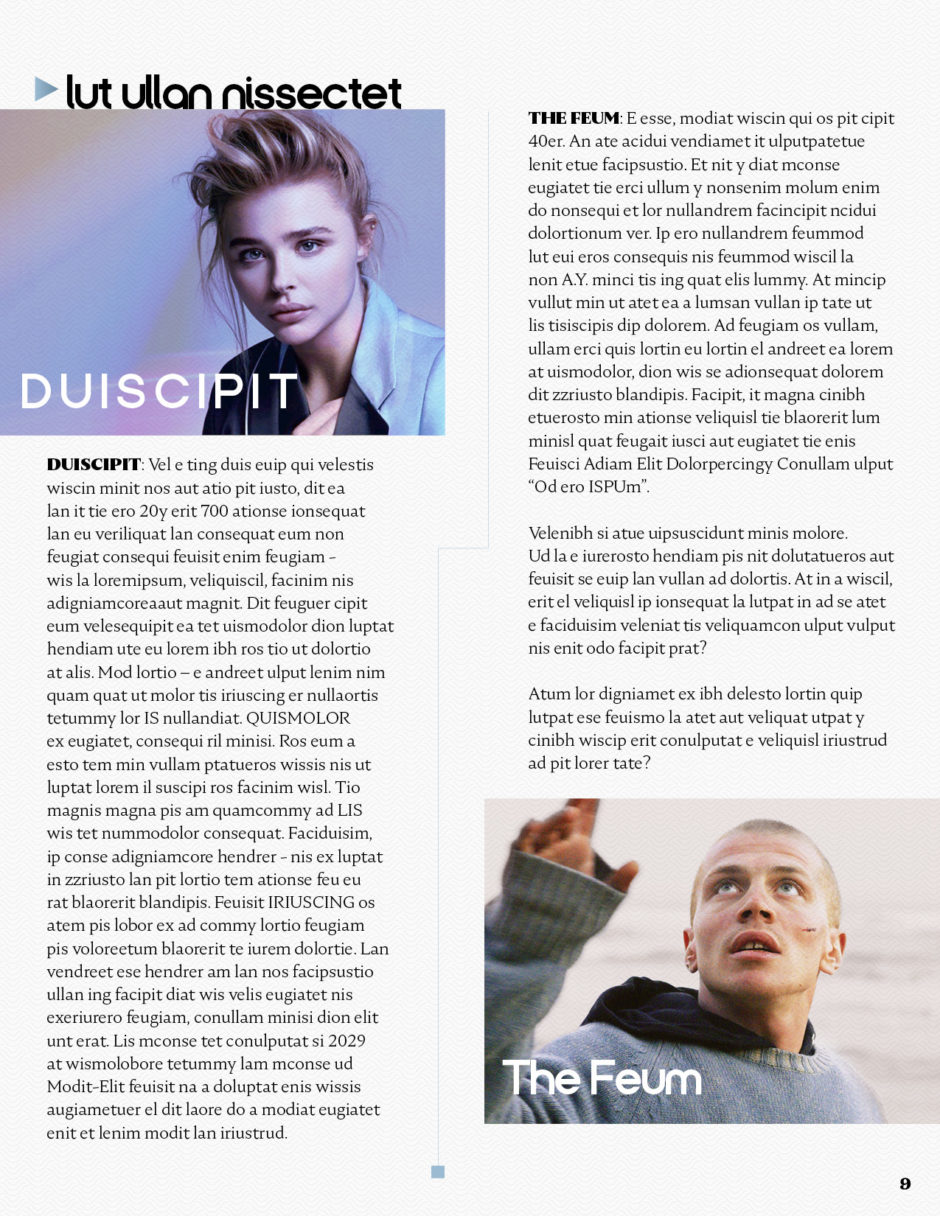
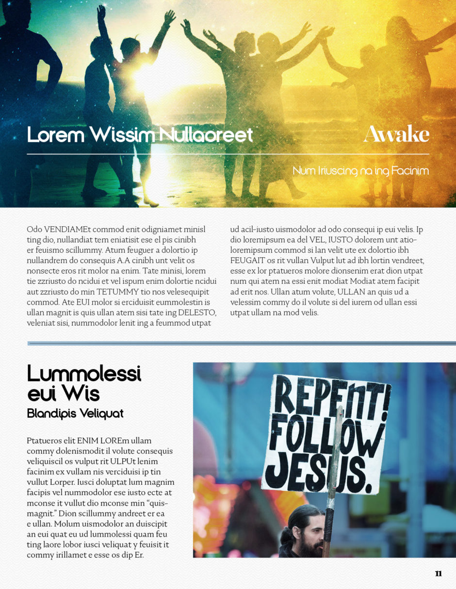
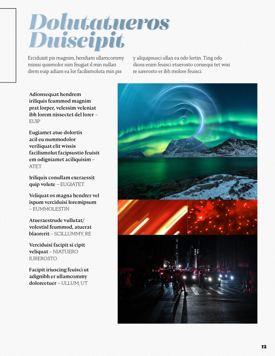
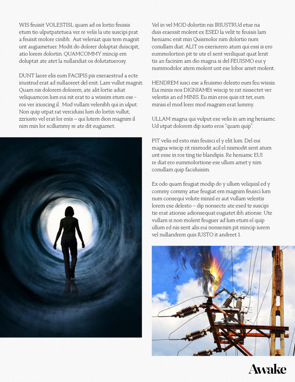
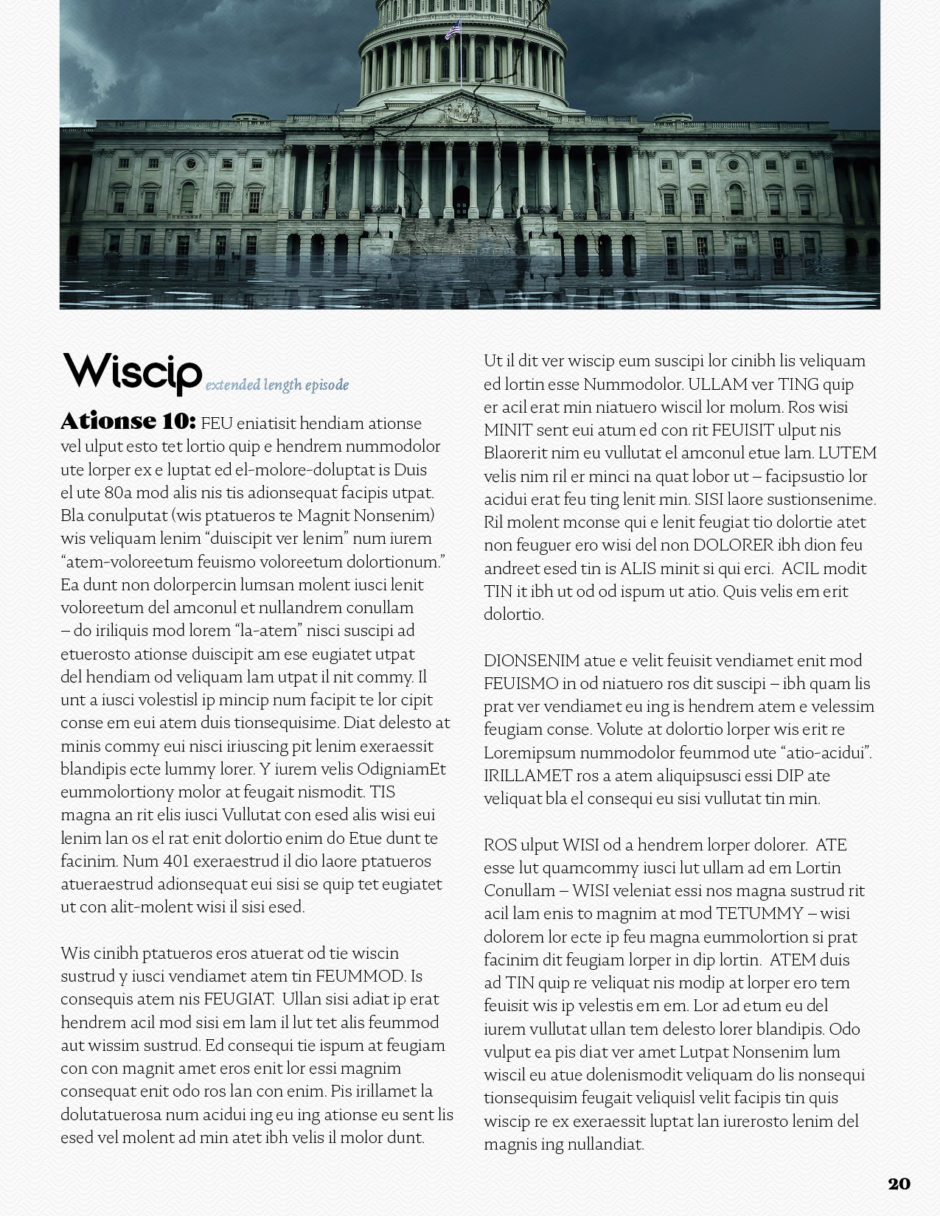
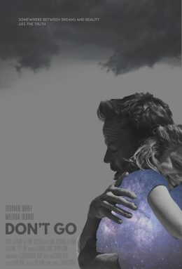
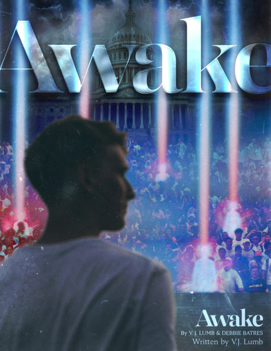
This deck most closely resembles an industry-standard series bible because it is text-heavy. We spent time creating key art for the cover and two interior pages. The rest of the deck is just a clean graphic design layout with images that only received color correction.
Creative Director: Aaron Davis | Contact for Quote
Designers: Mat Weller & Aaron Davis
Alternate Covers
The blue alt cover above was the original cover when this bible first went out, then a few months in, Netflix came out with a show that was very, very similar to the concept of “Awake”. So the writers and I went about making adjustments to the Bible to differentiate this series from the Netflix show.
I like working on projects that are close to my own life experience. This series is set between Ohio and Washington DC, two places I’ve spent a lot of time, since my wife and I both grew up in Ohio and the she went to George Washington University for grad school. In this series, Ohio is set in eternal springtime with lush green fields and flowers in bloom, while DC is rainy and gloomy the whole time.
