These guys are hilarious. We had so much fun working with them on this series.
Contact
This project was so cool, that I had to stop by to see the place when I was in San Francisco.
My heart lies in Indie Film. I still aspire to design Indie Film Posters, like I did at Indika back in the early aughts.
Increasingly, clients want to design a pitch deck and a series bible simultaneously, and over time, this has morphed into a sort of a pitch deck-series bible→
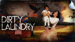
“JELLY” is the type of creature film you get from a female filmmaker. After “Tiger Sea,” Suki Kaiser came back with a psychedelic, sci-fi, stoner film. As→
This is a letter-size, industry-standard series bible. Most of our decks and a few of our show bibles are 16:9 HD dimensions, but the standard television series→
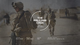
This “layout” pitch deck is for an hour-long television drama. A layout deck means that it’s designed with images as they are shot and relies heavily on→
With every new TV series pitch deck I work on, I have to get into the world of the show and live there for a bit. So,→
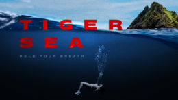
This “Tiger Sea” feature film pitch deck is a female-driven action movie with lots of suspense. I like how Suki Kaiser, the writer, describes the film as→
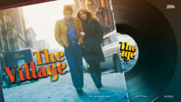
“The Village” is a one-hour, dramatic TV series. The show presents how Greenwich Village changed from a traditional Italian neighborhood to the center of the 1960s cultural revolution.
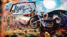
This TV Series Show Bible for “Lovejoy” is longer and more content-heavy than a regular pitch deck. To illustrate, a Show Bible or Series Bible has way→
On this military biopic pitch deck, we worked under a strict NDA with the director, who shall remain nameless. Therefore, we changed the title, images, and text→
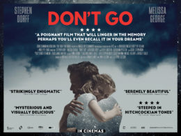
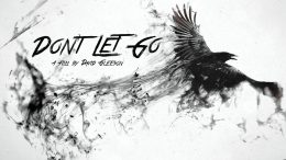
If you’re following the story of how “DON’T GO” went from a pitch deck to a finished film, then this update’s for you. I was so happy→
You may remember, I created the pitch deck for “Don’t Let Go.” After that writer/director David Gleeson, best known as the writer of “Tolkien,” secured financing for his→
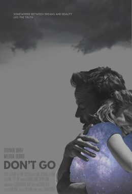
Ola Carson is such a great painter. I am so happy that she worked with David and me on these covers. David took textures from her painting→
I’ve been a huge fan of David Carson since the late 90s. In my office at Ohio State, I had a stack of Ray Gun Magazines within→
This film financing pitch deck secured funding at the Cannes Film Festival just weeks after we finished it. Then David Gleason, the director, and his wife, producer Nathalie Lichtenthaeler,→
When people say, “Admin Assistants run the show,” we couldn’t agree more. A wonderful assistant at Lionsgate, Dana Digiacinto, reached out to us for a 45-page pitch→
One day, out of the blue, I receive a hand-written letter with an 8th grade, African-American girl’s school picture stapled to it. It’s a very sweetly written→
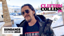
This video edit is from the 2019 Sundance Film Festival. I received a press pass to for my publishing startup, Pandemonium Screenplays. During the day, I shot→
I shot this video interview walking down Main Street in Park City, Utah, with Boots Riley, director of “Sorry to Bother You,” at the Sundance Film Festival.→
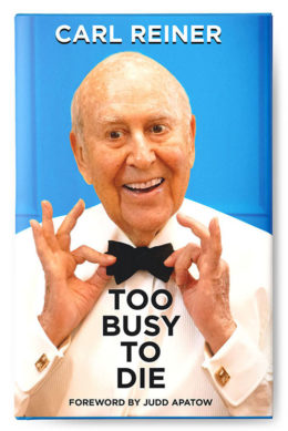
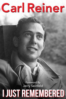
Mel Brooks coined the title for Carl Reiner’s book, “Too Busy To Die.” We were feverishly working on getting a few other books out, and Carl told→
This “Game On” Interactive TV Game Show Pitch Deck has a lot of elements from Fortnite and other gaming graphics. This series is an interactive game show→
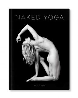
ALO Yoga wanted an Art Director to give them a few more layout options for their Naked Yoga coffee table book. Therefore, I did an exploration of several page→
I was so excited to work with another living icon, Renato Romano, who was in the 1969 version of “The Italian Job”. Historically, I’m a minimalist who→
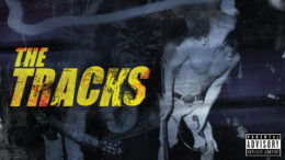
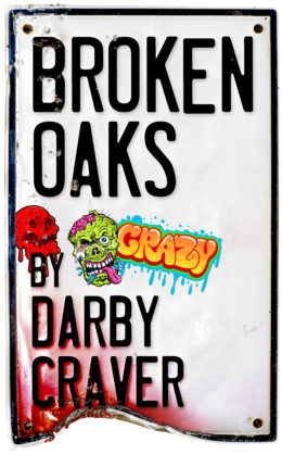
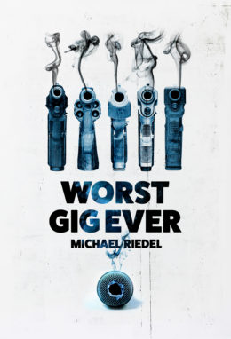
Five standup comedians get framed for murder and they nearly have to kill their way toward proving their innocence.
We’re cranking out fifteen album covers a week now. My goal is to make the cover art compelling but also to make them look as different from→
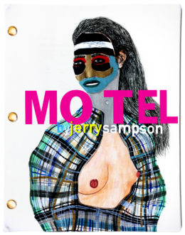
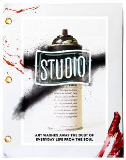
I made these Pandemonium Screenplays’ covers for my publishing startup. My company mission is to start everyday people reading screenplays. These covers are to show writers the level→
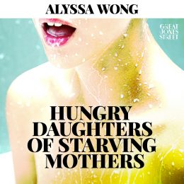
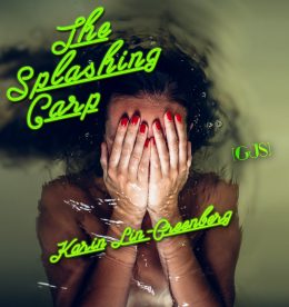
These album covers are the artwork for the short stories offered by Kelly Abbott‘s digital publishing startup, Great Jones Street. Inspired by the 1973 book “Great Jones→
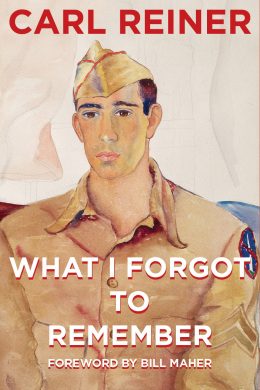
You may already know that I have been designing Carl Reiner’s books for the past few years. What these books mean to me work-wise is a ton→
This was my delicate take on an otherwise heavy handed period piece. ROLE: Art Director / Designer
At Warner Bros., I received a hand-written note for the “Million Dollar Baby” movie poster. A thumbnail sketch with instructions told me to pull images of→
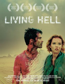
This Living Hell key art is at the beginning of the trend to start showing more of the actual gore instead of just an impression. I feel→
For this latest installment of Carl Reiner’s newest autobiography “I Just Remembered,” Larry and I set up shop in Carl’s house as RANDOM CONTENT Publishing and began working→
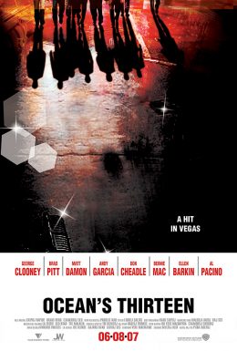
The creative brief for Ocean’s 13 stated that this installment should have an old Vegas brat pack feel. In other words, they wanted it to feel like→
This is the first studio picture from the director of Run Lola Run. I worked on the title treatments and photoshop compositing for these comps. ROLE: Art→
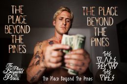
These are a collection of The Place Beyond The Pines title treatments inspired by Ryan Gosling’s character, Luke. The bottom right version I made by combining the→